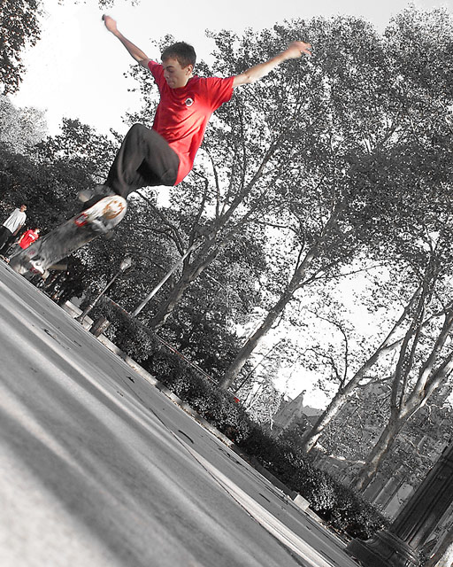
On the marble walkway at Grant's Tomb in NYC (where by the way Grant is not buried.) I caught a couple of new age dare devils flipping and flopping their skateboards on the extra smooth surface.
Cropping
Tilt
De-Saturate
Unsharpened
Statistics
Place: 162 out of 326 Avg (all users): 5.0152 Avg (commenters): 6.5000 Avg (participants): 4.8161 Avg (non-participants): 5.1712 Views since voting: 1025 Views during voting: 298 Votes: 198 Comments: 6 Favorites: 0
I think what works in this shot is the unusual angle of composition you have chosen. It fits with the attitudes and abilities of these guys (who amaze me to no end!).
In my opinion, the desaturation doesn't really add anything to this shot. It helps somewhat to focus the attention on the skater, but his read shirt may have done that anyway. Also, and this is just a small nitpick, there is a red dot that is seen in the middle of the picture, and to me, it helps to pull the attention away from the boy.
The "negative" space at the bottom of the frame helps to give the impression of the boy soaring through the air, but to me, that freedom of soaring is countered by him being so far in the corner -- kinda like he is squashed in there.
Interesting idea and great capture.
karmat
I was laying on my side on the ground looking up to the guy on the board, I had planed my shot so when he came to the light post he would jump and I would have focused on that beforehand so as not to loose him. The reason for the tilt is to comppell you to follow the lines to the skater, in that sense I would say it works. As far and the red dot? Well I had to look at this a number of times to find it, I could not have removed it anyway since the challenge was basic editing, so the second boy to the bottom of the skateboard or I would have.
Thanks for commenting on my shot and the constructive ideas.
I think what works in this shot is the unusual angle of composition you have chosen. It fits with the attitudes and abilities of these guys (who amaze me to no end!).
In my opinion, the desaturation doesn't really add anything to this shot. It helps somewhat to focus the attention on the skater, but his read shirt may have done that anyway. Also, and this is just a small nitpick, there is a red dot that is seen in the middle of the picture, and to me, it helps to pull the attention away from the boy.
The "negative" space at the bottom of the frame helps to give the impression of the boy soaring through the air, but to me, that freedom of soaring is countered by him being so far in the corner -- kinda like he is squashed in there.






 Add photograph to your favorites
 Add photographer to your favorites


 Photographer found comment helpful.
