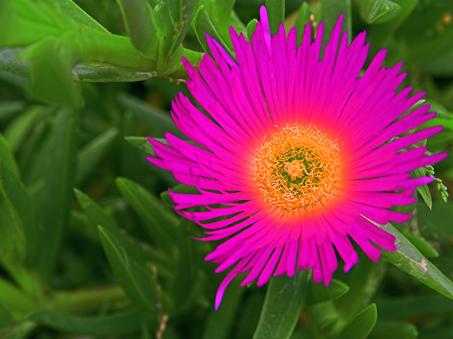
Flowers are a great choice for Thank You cards. They are pretty and simple. I like the fact that you used ONE flower instead of a whole bunch. I read your comments and I am having a hard time seeing where you DE-SATURATED the photo? The colors of the greenery in the background is a nice bright green. The only problem I have with the BG is that some of it is in focus and some of it isn't. It would have been more appealing if it was one or the other. The actual bloom is extremely over-saturated to the point it looks painted. It does not look natural. I think that is what hurt your score the most. Oversaturating to make colors brighter and more vivid is good, but sometimes we can go too far and it looks fake. I think that is what happend here. It doesn't even look like it belongs in this photo, it looks like a piece of clip art that you pasted there. Photo processing can add so much appeal to a photo. But sometimes, I think most of the time with something as simple and naturally beautiful as a flower, it is best to leave the natural colors nature has blessed the bloom with.
I hope this was helpful, good luck in future challenges.
The intense saturation here makes the photo look surreal almost. People are going to love this or hate it. I like the coloration, but the border between the green and fuscia is too strong...






 Add photograph to your favorites
 Add photographer to your favorites

 Photographer found comment helpful.


