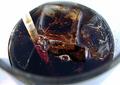
Far from "Impresso", I know...I just didn't want to rack my brains all week long think up of the "perfect"...which worked out, turns out this was actually my only idea. Shot on a white background with light coming from the upper right, minor fixing with PhotoStudio. I had another similar shot and I feel this is the best one.
I really don't care what this photo scores just as long as it's higher then last week's 4.
Statistics
Place: 94 out of 202 Avg (all users): 4.9404 Avg (commenters): 5.5455 Avg (participants): 4.8957 Avg (non-participants): 4.9903 Views since voting: 1107 Votes: 218 Comments: 12 Favorites: 0
Mmmmmm ... yummy. Challenge met. Nice crop. I like that the logo isn't fully visible. The lighting is a little uneven, too dark on the left, too light on the right.
The left side is a bit too dark, the right a lot too bright - at least for being in the same picture. I love the condensation and the "texture" of this shot. I don't like the marketing - wouldn't love to see this in the top 3 and starbucks to get a free dpc ad for a week, though.
What's with all the advertising shots this week? This is as good as the others, if not better - I just hope it doesn't win and we have to put up with that logo allover the front of the site for a week. 7
Darn it! Starbucks is CLOSED this time of night! I hate you! I hate you and everyone who looks like you!
*ahem* Right. Comments on the PICTURE, right. Um. My only real complaint is the very bright background and the way the logo almost fades into it. I like the focus on the condensation, and the close-up shot.






 Add photograph to your favorites
 Add photographer to your favorites


 Photographer found comment helpful.


