Initial Impression: Very "realistic" card - looks like something you could buy!
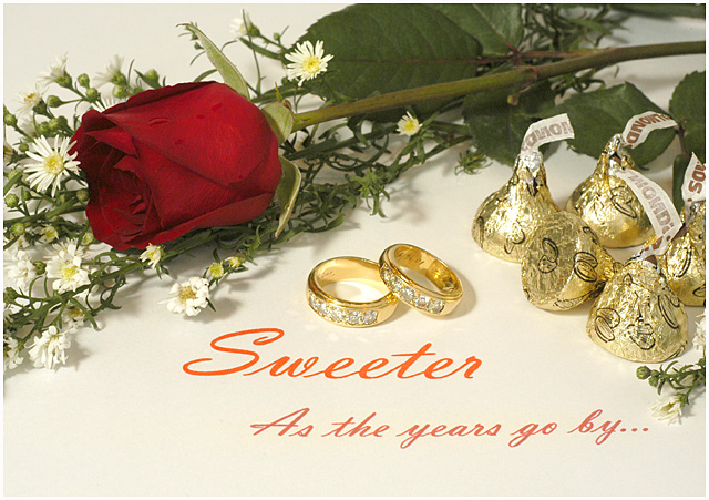
Composition: I like how you composed the shot. The sweep of the rose & the candy kisses cradles frame the rings & text nicely. I like how you have one of the kisses sideways - it gives a sense of spontaneity & enhances the romantic quality of the photo.
Color/Tone: It's not bad, but I think I would prefer the background to be a true white. Perhaps you were going for a soft candlelight-type white balance, but I don't really get that feeling from it. Also, I don't care for the orange-ish color of the text - a deeper red to match the beautiful color of the rose would have been more pleasing, I think.
Focus/Exposure: Very crisp focus! The highlights could be considered little too bright, but I think it works for the type of photo it is. Did you think of trying some gaussian blur to it?
Title: Well, the challenge said to name it the type of card it is, and you did, so the title was very well done! I don't think the parenthesis around Golden are necessary, but oh well!
Meets the Challenge: Yes - you've met the challenge extremely well.
Summary: Very commercial looking - I can totally see this on a "real" card. You really have created a beautiful photo in honor of your wife - congratulations!






 Add photograph to your favorites
 Add photographer to your favorites


 Photographer found comment helpful.


