::: Critique Club :::
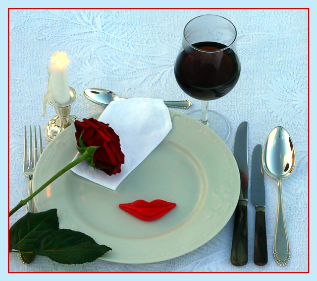
Immediately you open this image, it communicates quality. t's a quality setting and it's a quality photography. As soon as you open it, it's obvious that a lot of time and care have gone into making it. I frankly don't understand why it scored low 5's.
The comments are valuable in seeing what bugged people about it. You went for the flat light look and got it but what that cost you was definition. This is just the sort of image that you need an igloo for. That's the effect you were after but didn't have the tools to do it. The igloo is just a bigger version of the egg shell. You can make one out of silk or bedsheets. If you get a nice even round shape and pump your light in from outside, you get that overall lighting affect that you were looking for - and it's much more controllable.
With this kind of shot, you are allowed to cheat too you know. The wine looks a bit dull and flat and contributes to the image looking that way too. Most food photography doesn't use food. Ice cubes are plastic, ice cream is cornflour, gravy is gelatine etc etc. In this case, you could have used water first in the glass and then just dripped some wine into it until you had a balance of colour and light glow. I appreciate you were working against the sunrise, so you have to do this before hand and experiment a little.
Like some of the commenters I too find the colourings clash a little. The green plate and the blued tabled cloth don't sit well together. Perhaps a stark white plate would have worked better as a strong contrast to the black handles and almost black rose leaves.
Brett |





 Add photograph to your favorites
 Add photographer to your favorites


