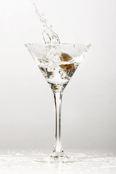
Shot on my kitchen table with my fridge as background. Used one wired speedlite flash, softened with a paper chandelier and one small gold reflector in the back.
A few ajustment layers applied: Selective color, Hue/saturation, curves, Channel mixer (40% opacity), Selective color again. Crop, resize, USM.
Disqualification Details
Spot editing is not permitted in 'Basic Editing.' Please review the challenge submission rules.
Statistics
Views since voting: 1372 Views during voting: 418 Comments: 24 Favorites: 0
sorry about the dq i really liked this 1....if its any help there have been a tone of dqed shots in this challenge so at least u rn't the only 1....it does hurt tho...
Nice image. Congrats on the results... A lighting suggestion. Try bouncing the flash off the background to create a backlight situation. Then you can fire some flash right into the face without any super harsh reflections. This will also allow edges to become more prounounce and detail to pop. Backlighting glass is a blast... Great work...
Ohhh.. the thumbnail looked so promising... What I mean is that when I opened this shot there were a number of details that drag this shot down a little bit and all of them could have been avoided with just a little bit of effort on your behalf. To be specific, the drops on the table (or whatever surface the glass is standing on) just makes this seem sloppy and so do the water drops on the outside of the glass, like you were just lazy and didn´t make the time to clean up after each effort of the splash.
Anyway, sorry for the rant but I just hate to see such a good image spoiled with what I percieve to be laziness as I could very well have given this image a 9 or even a 10 if the only drops in the image were the ones in the air above the glass. To be clear though, I still think it´s one of the best in the challenge and I gave it an 8, I really like the splash part, great timing and this is very nicely lit and the backround is very fitting.
This is a great shot. I was tempted to say it was overexposed, but looking at it again, I don't think so. The simplicity of the color palette is great.
Perfect background for this "clean" image. The sole color of the olive among variations of soft gray scale acromatics does not overwhelm the concept or theme. Rather, the refraction at the liquid's surface and the reflection counter to its placement say "BEVERAGE" more boldly than "OLIVE." Good job.
There's alot of stop motion in this challenge but this is my favorite so far. The simplicity is very effective. My only critique would be the liquid on the tabletop. I would have like it better if it looked like you got this shot the very first try. But still one of my favs so far. Good luck!
most of the details in water stream is washed away, the background is not totaly white (ofcourse it is fine if you were looking for the exact gradient effect). It could have been better if you've incresed the distance between the subject and the background and used two separate lights for each of them.





 Add photograph to your favorites
 Add photographer to your favorites

 Photographer found comment helpful.


