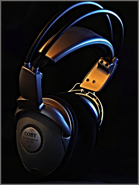
I like the blue and orange of the hightlights that shape the headphones so we can see them against the black. I like the composition - just wish the crop wasn;t so tight on the top. Very nice exectution and subject - makes me want to pick them up and hear what music is playing. 8
interesting shot... i like the blue/yellow tones of the lighting... i think this would make a good product photo if there was a bit more highlight on the brand name / logo on the lower left... I also feel that the composition may be a little too tight at the top... maybe just a bit of extra breathing room up there would be good also :)
Hmm... the disconnected headphones don't do much for me in terms of strength of topic connection, which is not to say it's off-topic. Visually it's a fairly good shot, a commercial art feel to it, although I think I would have preferred it a bit crisper.
Nice subject, composition and color. I personally see the light as a bit harsh but just in a few places. Easily fixed with post processing after the challenge. Nice job.
I've started a new habit of picking my favorite thumbnail and voting on it first in each challenge, rather than just starting with the first random one to pop up. This is my favorite this week. Great lighting, great sharpness. On closer inspection, I'd like to see just that very tiny bit of the top of the headphones that seems to be missing, but otherwise perfect. Great shot! 9






 Add photograph to your favorites
 Add photographer to your favorites


