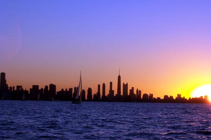
This is really a breathtaking image, and as already stated, the two things that would improve tis the most would be to have made it larger and straightened the horizon. Judging by the camera, a 640x480 shot should have been manageable as long as you didn't need to crop much. The connection to the challenge is a bit of a stretch, but possibly something like "Greetings form Chicago" or just "Chicago postcard" would have been a better tie-in to the challenge.
This also may have looked neat croped more like a panorama, but overall not bad.
In the future, try to submit a larger image if you can. If you need help with the technical aspects of image resizing/post edditing stuff feel free to P.M. me.
Image is a little small and the focus seems a little soft. The brightness of the sun is overpowering and there seems to be a lens flare on the left side of the image. i love the gradient of the sky from blue to orange. The horizon is a little tilted. I think this would have more pizazz without the sun.
nice colours, horizon falls off to right, needs foreground interest, boat is confusing the background, image does not use full 640 px - other than that 'nice' - 6
Not sure that the title is a category of greeting card, but not taking off for that. The silhouette is nice (if a little fuzzy), but the sun is WAAAAYYYYY blown out (I know it's a difficult subject). This photo would probably work a little better and be more visually appealing if you were to crop out the sun and perhaps include a little more of the skyline to the left. Your horizon is tilted. On a good note, the colors in the sky (other than the sun) are beautiful, and I like having the sailboat in the foreground. The placement of your horizon is also good.
Not really sure this meets the challenge, but there are other problems that are more serious. The small size makes it impossible to fairly rate this image. The unlevel horizon is one of my pet peeves. JMO.






 Add photograph to your favorites
 Add photographer to your favorites


