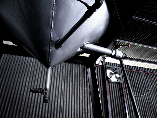
I just done with some changes like:
-Make the whole photo more contrast, so to make the shape of the metal cone bring it out more.
-Desaturation, but just left the red behind.
Statistics
Place: 253 out of 326 Avg (all users): 4.5561 Avg (commenters): 3.6000 Avg (participants): 4.3763 Avg (non-participants): 4.7054 Views since voting: 775 Views during voting: 260 Votes: 205 Comments: 6 Favorites: 0
Congratulations, you have your first Challenge under your belt.
You have an interesting picture here. I can relate to it in a sort of Science Fiction way. Looks as if we are seeing a picture of a ceiling and part of a corregated wall. Lots of angles, and lines. That touch of red is good. I like the wide range of darks and lights.
It usually helps in photography to keep your image simple, and that is part of the problem with this image. It a lot of information to absorb and it is quite difficult to find the major subject. So my first suggestion is to make the photograph as simple as possible and still tell your story.
Finally, your title is a bit confusing. It probably would be better to use all lower case letters, and find a title that expresses the meaning of your image. Our voters tend to be in a hurry, and just don't take the time to puzzle out strange titles.
All in all, especially technically, you've done well in your first challenge. I shall look forward to seeing more of your work.
(I'm making an attempt to explain why I give any photo 3 or less. Obviously I won't like these photos, but DPC is a place to learn a) about what works in this environment and b) about what other individuals think. Please don't be despondant just because I don't like your shot. Rather than that, if your entry scored low, please try and understand one commentor's reasons.)
1/ I'm not sure if I'm looking at a single subject or a single scene. The title says 'machine' or something like that, but what stands out more are the backing, the ventilator and the overall scene elements.
2/ There's a slightly out of focus feeling on the tip of the machine whereas the corrigated metal is sharper. This makes the photograph uncomfortable for me.
3/ There's dark and light, but I'm not convinced about the placings of either for any particular reason. Overall, (unless I've missed something) I feel that this photo is a collection of unconnected bits rather than a coherent whole.
Definitely a "from the ground up" photo, but for me the composition or overall colors needs...something. My favorite part is actually the red handle(?) end in the upper right quadrant.





 Add photograph to your favorites
 Add photographer to your favorites

 Photographer found comment helpful.


