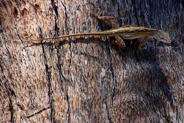
6 - Good potential here. Criticism; lighting is the biggest issue and the liZard seems either out of focus or 'blurry'. Difficult with the tree bark background, but definition on the lizard, the lighting and making it 'contrast' somehow again the bark, would have made this a better shot in my opinion. Technically, while no expert in this rule, it seems you have used 'the top third', however the body of the lizard is on the 'intersection', in this case, I would like to have seen the head/eyes on that intersection, or else possibly with a different angle that 'top third' rule enhanced in some way.
Nice placement of lizard in the frame. Light/shadow transition is nice and nearly follows the thirds rule. Would like to see head more at the intersection of the thirds though.
This is just a matter of personal taste, but I'd have put the lizard in the lower third of the picture. Good tones. This really illustrates the lizard's natural camoflage (? spelling).





 Add photograph to your favorites
 Add photographer to your favorites


 Photographer found comment helpful.


