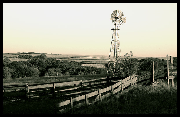
I cropped this, desaturated some colors and grayscaled it and then RGB colored it again. Adjusted contrast. That's it. I hope it does well. I "market tested" a couple different ideas with my family and this was their choice.
Statistics
Place: 38 out of 354 Avg (all users): 6.1082 Avg (commenters): 7.2000 Avg (participants): 5.7172 Avg (non-participants): 6.4015 Views since voting: 1062 Views during voting: 289 Votes: 231 Comments: 10 Favorites: 1 (view)
However, most of the image is at the extreme tones -- bringing the exposure of the shadows at the bottom up and bringing the highlights at the top down does wonders for the image. Don't get me wrong, it's nice the way it is, but there is so much detail hiding in the shadows and highlights that only help the image when brought out. After this, add contrast to taste and it would have gotten a 9 from me (with contention for 10 on a second pass), but as it is -- 7.
Love the rural sense of this. The diminished colors really work well. You might up the contrast a hair. Overall - very nice and suits the challenge perfectly.





 Add photograph to your favorites
 Add photographer to your favorites


 Photographer found comment helpful.


