Author Thread
Post actions
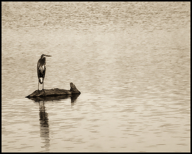
isn't it just a shame, the detail that we lose at these size constraints...beautiful image, horribly under-appreciated. if you don't mind, would you be so kind as to return my model ;-)
Comments Made During the Challenge
Post actions
i love this!! i love how you desaturated, it really adds to the pick! great work!! the bird looks as little blurry though??
Post actions
The monochrome works well its just that I'd like the bird to be sharper, Comp is exemplary.
Post actions
I might have moved the bird up to the top third. The shadow would balance a little better there I think. The eye wants to move up and across and we are going across before we get up high enough in the frame.
Post actions
Beautiful example of the rules of thirds.
Post actions
Just another proof that Less is More. Great composition, not so sure about the montone
Post actions
good capture, meets challenge very effectively, bird could be sharper IMO
Post actions
I like it, looks like a bronze statue. Wish it was a little lower in the frame, JMO.
Post actions
seems to be more middle than at the upper or lower left intersection.
Post actions
Birdy Birdy. Great shot and choice of sepia. Thanks for Sher.....ing. 7








 Add photograph to your favorites
 Add photographer to your favorites


 Photographer found comment helpful.


