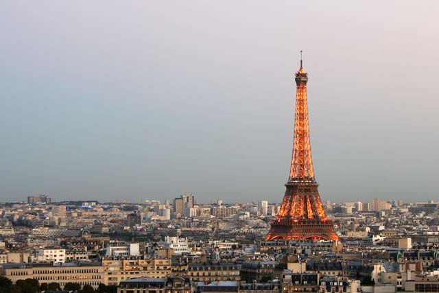
Eiffel Tower looks wrong somehow! Almost as if it has been superimposed onbackground! Know it hasn't but the colour makes it odd. meets challenge very sharp
A distinct use of the rule. The tower stands out clearly as the primary subject against the secondary skyline of the city, both placed strategically in the visually pleasant zones. The top of the tower is also well placed against the sky.
This is such a great idea, but lacks something. Hmmm - maybe the time of day. I like the bronze tones of the Eiffel tower but it needs some contrast to really give it pop. The overall dim blue of the sky and the brown/beige tones of the city just aren't enough to give it the backdrop it truly deserves.
Wow, this is terrific! Magnificent use of thirds with the tower and the horizon. Beautiful colors. Top of tower looks just a tad blurry compared to forground.







 Add photograph to your favorites
 Add photographer to your favorites


