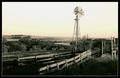
cool setting a tad over sharpened, but i assume that was the look u were going for cause it is very apparent...and to me it doesn't harm the shot any just gives i a greater sence of texture and grain...
once again pretty shot i like the color tones, and the feel (also of corse applies to the rule) so good luck
I don't like the halo where the horizon meets the sky - very distracting. Caused by too high radius using unsharp mask or the shadow/highlight tool perhaps?
Other than that it's not too bad. It's perhaps a bit distracting how you've tilted the camera upwards to include more of the sky.
I love the minimalism. This would be a great study in black and white as well. I wish it had a touch of red somewhere. Really well done. So graphic in it's simplicity.







 Add photograph to your favorites
 Add photographer to your favorites

 Photographer found comment helpful.


