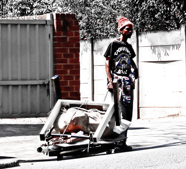
IMHO you have too much contrast here. I'd like to see more detail in the man's face. The suff in the wagon and the details in the fence are blown away.
I think I see what you're going for here, with the subject squarely on the right third line. However, there's too much other stuff in the picture to really keep one's eyes directly on that spot. I'm also not sure I like the saturation/color washing that you did. As a whole I think that technique is overused, and really needs to add something to the picture to make it effective. That doesn't happen for me here.
The subject itself could have made an interesting study, if he was willing to cooperate.
Great use of desat here. The red really pops out on the three items - the bricks, the hat/face and the bundle of things in his carrier. I love the urban sense of it. Striking and it has great contrast.
Nice placement of subject in the line of thirds on the right of the frame. Head/body are about at the intersection of the upper/right lines. Not sure what the man is doing, interesting image though.







 Add photograph to your favorites
 Add photographer to your favorites


 Photographer found comment helpful.


