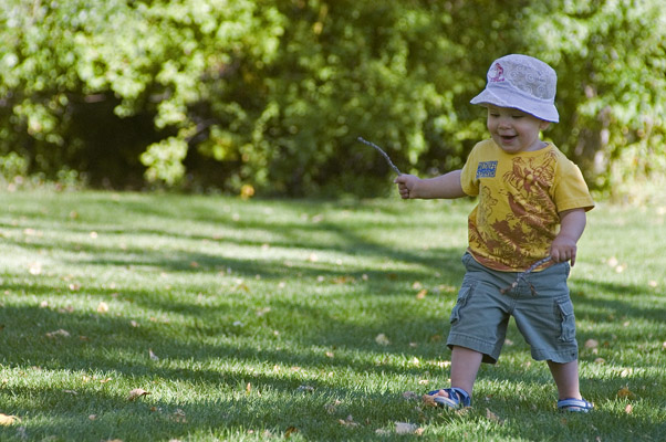
A little too far off center for Rule of Thirds unless the twig in the childs hand is the main subject. Otherwise a nice natural expression. More flash fill would have brightened the child somewhat to overcome the bright trees in the background.
You need to crop off something on the left. I don't think the boy is ieve on the 1/4 line. It's a cute picture though. If it had been me, I would have forgotten about 1/3's and just filled up the frame with the boy.
5 - Good potential here. I think you captured a bit of character too, but, criticism; I think 'he' is getting 'lost' in the background'. I would like to have seen more definition, possibly even the use of a b/w or sepia, although I know that contradicts what I just said about the background and that it might not work well in b/w or sepia, so not sure. 'He' is also either 'softened' or 'blurred' so I would like to see again, more definition, more 'depth', by making 'him' stand out more. I like the perspective and angle, but would like to have seen an even sharper one. Possibly a slight nudge rotation on the right side upwards, not sure. Regarding the Challenge, while no 'expert', I would like to have seen either the child's face placed more on the 'intersection' or else the use of 'right third' used for his 'entire body'. So a tighter crop on the left side perhaps, but as I said, although I like the angle, if it was even sharper, you may also have obtained a 'rule of thirds' with your 'base/background', the grass perhaps going up 'two thirds'.
Nice placement of subject in the right of frame; gives him somewhere to walk in to. Face might be a tad to the right of the 1/3 line. Color temp is a little cool due to the shade.
This popped up on the screen and I immediatey smiled. It could use a bit of curves adjustment to really up the colors. Happy baby - he's having fun. I like that. The composition is well done. If he had on a red shirt, the contrast would really add some pinache to it.






 Add photograph to your favorites
 Add photographer to your favorites


 Photographer found comment helpful.


