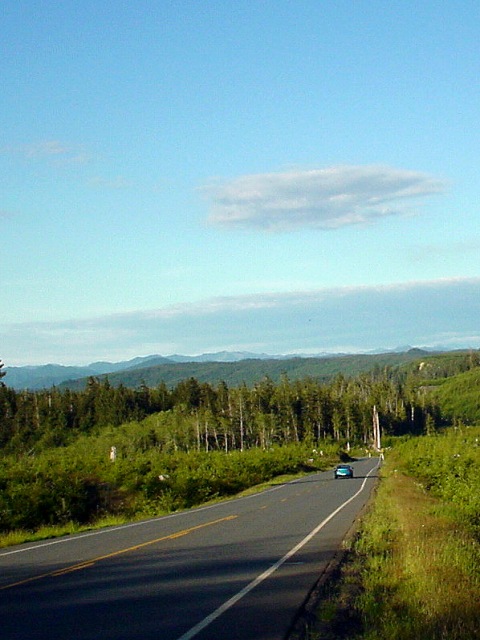
Too much sky. Color and concept is good. Might have gotten tighter shot of road and vehicle. Bottom third of photo is where action and subjects are. Not top sky.
With the subject being "on the road", there is too much sky. It would have been been better to have lowered your camera angle and pushed the sky nearer the top of the frame.
Very nice, thank you for including the car. This is good enough to say, job well done, no critiques to offer, sorry. Photo 9 Creativity 7 Road 8 total 8
This would be a better shot if you wer up about 20 feet past the shadows. The sky and colors give the shot a nice feel. The shot is a bit too grainy and not sharply focused.
Home in the country - lucky you! The shot doesn't look quite straight though, I'd crop out the little bit of tree on the right, and while I like the use of ROT, I would probably show 2/3 road 1/3 sky since this is supposed to be about the road. Just my opinion.
You seem to be just a little crooked -- leaning to the right. The only other problem I see is that the picture is slightly grainy -- either camera image quality or wrong camera settings.





 Add photograph to your favorites
 Add photographer to your favorites


