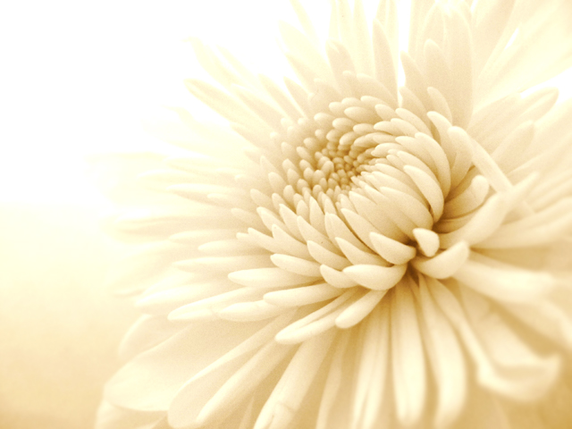
Well, I have to hand it to you! Congrats on the high score! There were so many flowers in this challenge and what makes your entry stand out is it simplicity. I love the fact that the flower just fades away into the background. It looks so soft, I can almost smell it. Flower pictures can be very boring and predictable. Your image is not. Wonderful job you did here. I would definatly buy this greeting card. This could be used for many different themes.
Very nice. Usually I would like the blown out area at the top left, but I think in this instance, it is fitting. Excellent focus on this close up and like the muted colors.
I liked this the minute it popped up on my screen. The monochromatic theme is very effective with the petals blending slowly into the light. Perfect for the category you chose. There is enough detail for it to work, but it has a softness that I like. The DOF is good.The light to the left and upper area might be a tad bright, but no demerits for that as it could just be my monitor. With a light colored flower, you have to have a lighter level somewhere anyway. This would be pretty even if it weren't for a challenge as specific as this.
Great shot, perfect "category", love the treatment of the shot. For me, the blown-out background really adds to the shot. You could "read" a lot into that!
Pretty. Excellent greeting card, I would buy it. I like the soft touch. The highlights look more blown out than fading to white, but that doesn't bother me much.







 Add photograph to your favorites
 Add photographer to your favorites

 Photographer found comment helpful.


