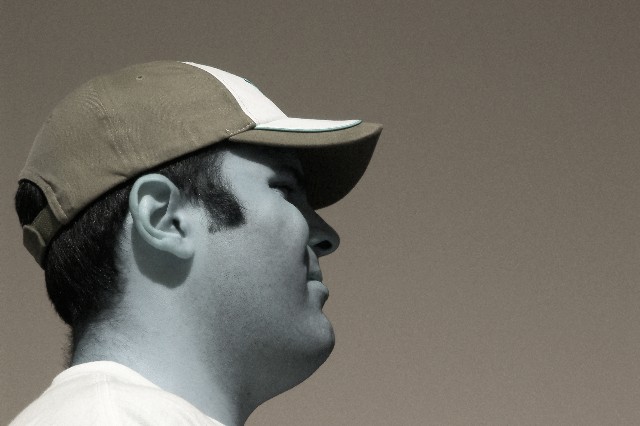
Compositionally, you have nailed the challenge. The head is right on the left third looking into the frame and that helps to give the shot stability and balance. Also, I like the angle you chose to shoot this from. It makes him feel towering and intimidating.
Technically, the focus is good, and the colors are okay. The whites are white, and there are dark areas giving it a range of color. I think, though, that the slight sepia tone just doesn't work. Perhaps a straight black and white would be better. The angle of the shot, the expression on his face, and the sepia just doesn't "jive" together. And it may just be that the hat kinda fades into the sky.
The shadows on his face don't bother me. I think enough detail is visible, and it kinda gives it some "atmosphere" or allows the viewer to have a bit more insight into the context of the shot.
Overall, a technically fairly-well done shot. I think, based on my past experiences with dpc, that the subject just didn't identify with the viewers (or vice versa). It is basically a shot of a young man standing on what appears to be a bright sunny day. Other than the title, there is nothing to truly engage the viewer and make them want to stay and look.
While I can visualize the rule of thirds, I don't particularly care for the overall color treatment you chose. It's always odd to see people with blue faces. I'd be curious to know what look you were going for.
N ice job following the rule of thirds, it seems a bit over, but what can you asay. I really don't like the blue-ish color in the man's face, I think it's tryijng just a little too hard to be artistic.







 Add photograph to your favorites
 Add photographer to your favorites


 Photographer found comment helpful.


