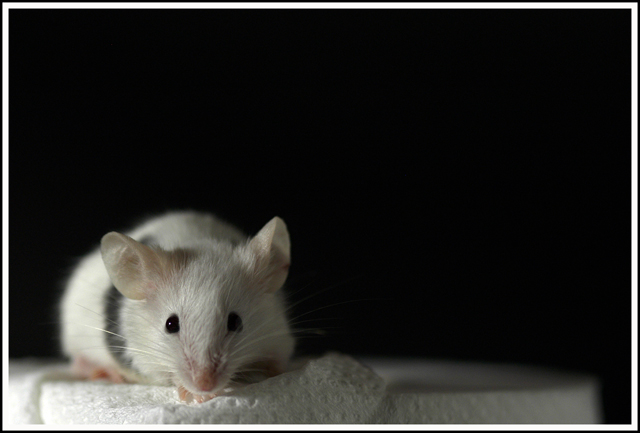
You have its eye on the left vertical thrirds line and would gain even more impact by moving them up in frame to the bottom horizontal thirds line. Subjects on the "intersection" of these lines have far more impact ... hence the subject of the challenge
7 - Like this and the colors. Criticism; sharper focus on the nose, like the paper towel/serviette, perhaps even incorporating both, for texture, not sure. Like to see the colors even more vivid, especially since they are fairly 'soft', pink, grey and white. Technically, while no 'expert', I would like to have seen this placed more strictly, with perhaps a little more paper towel showing, or something. Lighting is nice, but like to see it touching the face a little more. Just more detail in it's face.
LOVE LOVE LOVE this on all levels. Perfect challenge entry, great lighting, super detail, wonderful contrast! Man and to boot, it's a mouse!!!! THANKS for the smile of the night!






 Add photograph to your favorites
 Add photographer to your favorites


 Photographer found comment helpful.


