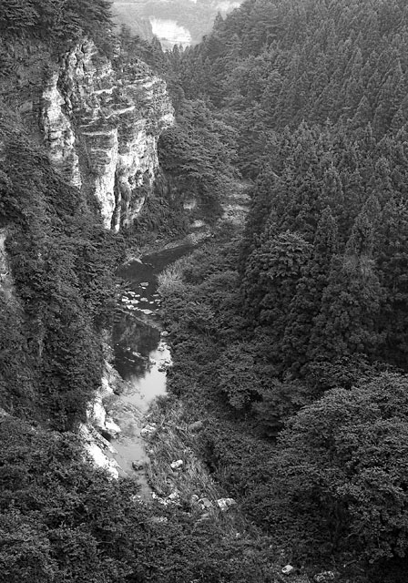
This should be a great picture, but for few things.
The rock face seems to be the subject, but the low contrast and sharpness of the object lead your eye down to the river to the begining rapids which take your eye right off the page because there's nothing in the trees to draw you back in at the bottom right. Your brian wan't to know where all tha water is rushing off to, and then it rushes off also.
Can't help but wonder if this would not be an absolutely awesome fall color shot though, with the bright deciduous parts of the forest capturing your attention more, and leading your eyes back in.
Such a nice photograph but I find it to be slightly weakened because of the low-contrast B&W effect.
Other than that it does seem to be slightly soft, especially when looking at the cliff and some portions of the cliff and the riverbank seem to be overexposed.
But I quite like the composition.
I took the liberty to do a quick edit in Photoshop:
//www.andri.org/temp/dpc-skogur-fikt.jpg
(Let me know if you want the image removed.)





 Add photograph to your favorites
 Add photographer to your favorites


 Photographer found comment helpful.


