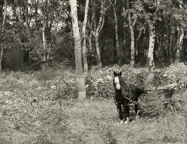
This is too busy to be interesting. The highlights up on the tree bark is distracting and the cart blends into the background. Your title doesn't do anything to inspire or explain the shot.
This was a good idea but there is so much grey/medium contrast here that most of the picture blends in together making it hard to outline objects. Maybe play with the brightness/contrast settings to help this?
I like this alot. The horse's coloring is very striking with the white face. I'd like to see more contrast, but other than that, it's a nice shot. Maybe delete a tad of the foreground and it wouldn't mess up your rule of thirds, and actually might enhance it from a horizontal perspective.






 Add photograph to your favorites
 Add photographer to your favorites


