Author Thread Comments Made During the Challenge
Post actions
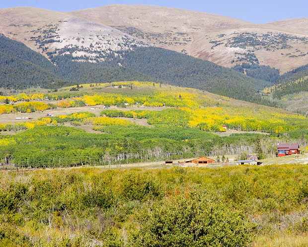
Composition is good, but the colors look washed out.
Post actions
This is a very pretty scene, I'm wondering is using some curves or levels adjustment if it would make the colors even richer.
Post actions
not sure what point of focus is meant to be for this challenge. if it is the houses then they are a little too small , good capture otherwise.
Post actions
I like that the rule of thirds is not blatantly obvious here. But without the rule of thirds placement, the buildings would be nothing more than additional landscape.
Post actions
Looks washed out, does not fit the theme
Post actions
a little over exposed....
Post actions
nice picture. I think i would kick up the contrast some and show a little more sky.
Post actions
add a bit of contrast and you get more points next time






 Add photograph to your favorites
 Add photographer to your favorites


 Photographer found comment helpful.


