*Critique Club*
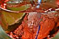
Not really my kind of thing, but the effect did turn out kind of cool. The way it looks like it's got motion blurr is interesting.
The color is really nice. rich looking. Not dulled or dark. I think that the lighting on this was good to bring out the color and also the detail in the lettering.
I think it's good how the subject fills the entire frame. Nothing distracting in the shot at all.
Focus and clarity look ok for being shot through the honey, you still got some crisp lines on the lettering and I think that is a good thing.
Not really much else to say. While I think it's technically well done, it just doesn't personally appeal to me.
~Heather~ |








 Add photograph to your favorites
 Add photographer to your favorites

 Photographer found comment helpful.


