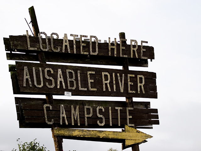
Interesting picture. I really like the sign and the rustic look it has but the bush at the bottom is a bit distracting and not big enough to compliment the picture. The background is off too. Maybe cropping some of the white space out would leave the focus on the sign then the bush wouldn't be such a distraction too.
I would rather see a picture of the campsites and have Ausable Rier Campsite as the title. While technically OK, there is no emotion or interest in the composition.





 Add photograph to your favorites
 Add photographer to your favorites


