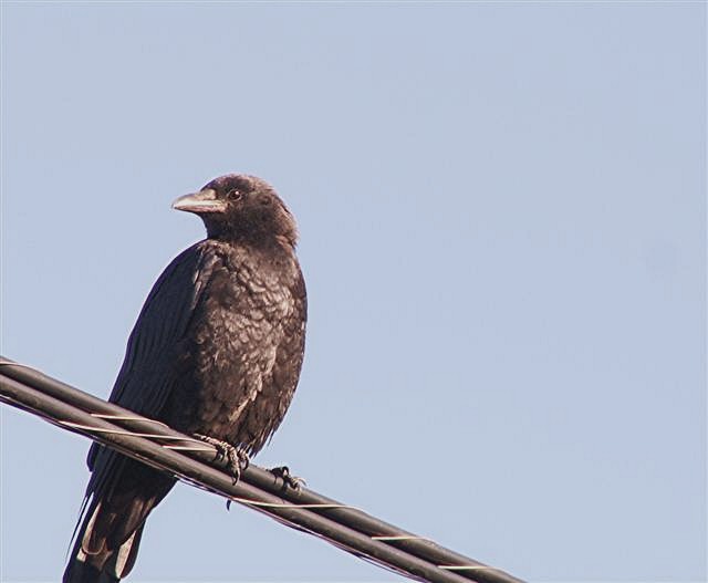
The focus looks sharpest on the line, and the birds face and body appear to be slightly OOF, which confuses my eyes as to subject. Keeps leading me down to the line. Over all I'd say the comp is good, but that flaw overrides that. better color in the sky would have been nice. 5
You have a lot of what is usually jpg compression artifacts. You may be compressing too high, your file size is only 29k so you had room to go. Try little amounts of compression at a time. There is some threads in the forums about this if need be. Your colors also seem a little dull, check if a slight curve adjustment can get you a better sky or see about a circular polizer. Very nice placement of the subject though, you're right on with this.
I really don't know if there are exceptions to the rule of thirds, but (I'm assuming the head is the primary subject here) the majority of the "content" is in a different third. I guess that's ok. we'll call it the "rule of birds" ;-)






 Add photograph to your favorites
 Add photographer to your favorites


 Photographer found comment helpful.


