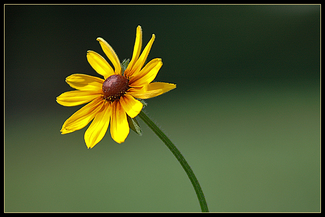
This is beautiful. . . and it takes a lot from a flower shot to touch me since there are usually quite a few of them. I love how the background looks like a gradient, and how that bright yellow flower almost looks super-imposed on the photo. And your border is PERFECT! Fantastic job!! 10
7 - Nice and good potential. Criticism; the frame detracts in my opinion. Whilst no expert in this rule, and not only for this Challenge, I think this shot would have been better with more height, and therefore the flower (or centre) placed almost spot on the 'intersection'. The colors are nice, but would like to see a little more bold or contrast, again especially on the centre of the flower. I like the background, but the green coloring seems to slightly 'clash' with the green of the stem in my opinion, or rather, is not complementary, but minor. I think the frame adds to that 'conflict' too, not sure. It is the simplicity I like most in this shot.
Very nice. There are several shots like this, so it's not perfectly original, but I like it. Maybe a touch more detailing on the stem would really give it some pop.







 Add photograph to your favorites
 Add photographer to your favorites

 Photographer found comment helpful.


