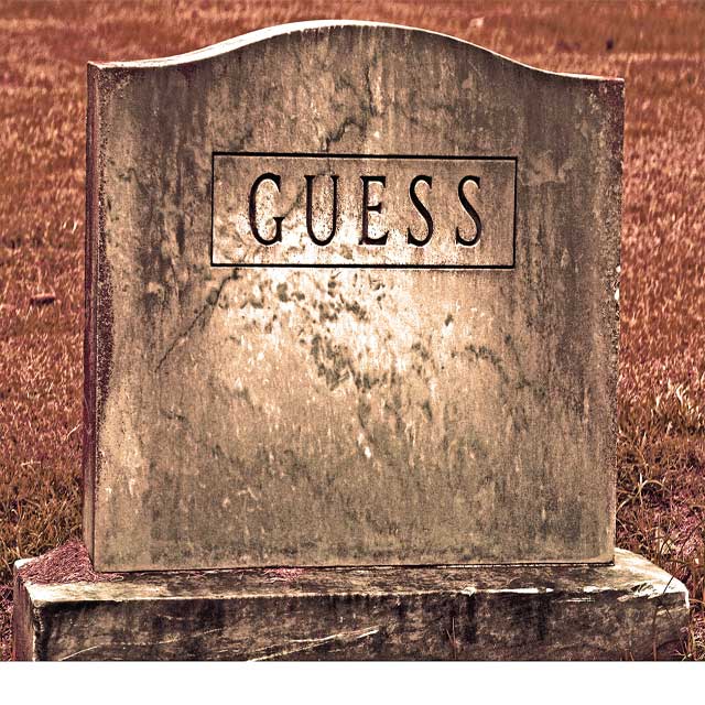
Initial Impression: "Man, that's huge!" Humorous, interesting color, looks like a poster to me (for some reason)
Composition: It's not exactly thrilling - the tombstone is kind of just right there in front of you. Also, as people commented, the white stripe at the bottom is a little off-putting, but it seems more like an error in cropping, rather than a conscious choice. Otherwise, you placed the subject nicely in relation to the other sides of the photo.
But then, the power of the shot isn't in the composition, I think. It's in the large-sized presentation of the gravestone, with it's unusual name, tied humorously to the challenge with the title. I don't think a different angle would have been better, and would probably have hurt your photo.
Color/Tone: I'm torn about the coloring. At first, I kind of recoiled at the brownish rust tone, but the more I look at it, the more it grows on me. It has a sort of dusty, "died-with-his-boots-on" Western cowboy feel to it... which could be another destination Of course, that has no connection to the challenge, but so what? I think you're color choice has probably made this more interesting than it would have been if you had gone for a more realistic look.
Focus/Exposure: You did a great job on both - the tombstone is in crisp focus, and you can see all sorts of grimy detail.
Title: Like I said earlier, you did a nice job tying the name of the decased to the challenge through the title. Very well done.
Meets the Challenge: Well, we're all heading to the grave, that's for sure. I think it meets the challenge extremely well.
Summary: As a commenter said, it's has a nice graphic quality to it. I won't lie and say I love it, but apart from the white stripe at the bottom, there's nothing really to fault it, either. It's a clever, solid shot, made extra special by the humor you found (in death, you sicko!)
Love the photo. Am confused about the white border at the bottom, as to what the purpose of that is in the composition, it takes away from it in my opinion.
I immediately noticed the white area near the bottom. It should have been cropped out. One of those details that you have to be aware of. I did like the tonal treatment you did on the image, and the detail of the stone is really nice.
I like the simple graphic quality. My main nit pick is to straighten it so that it is parallel to the bottom of the shot. Also, remove that white area where you missed the crop. OOPS.






 Add photograph to your favorites
 Add photographer to your favorites


 Photographer found comment helpful.


