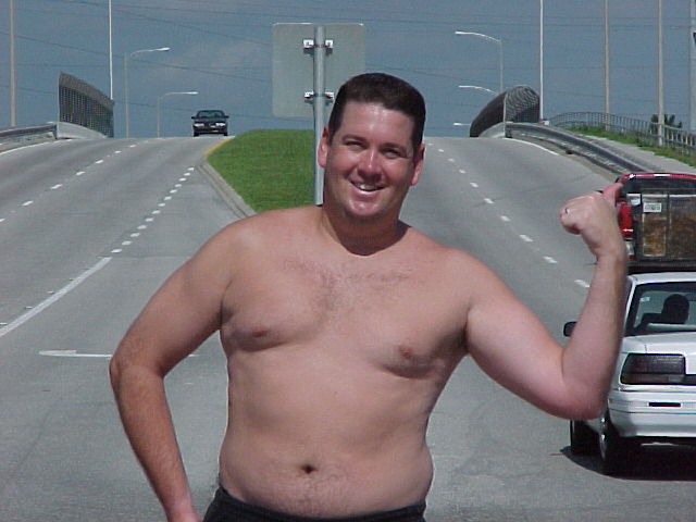
Annida, I agree with you, all those personal comments are uncalled for. Having said that, if you read the other half of the comments that remark on the execution of the photo, you'll see that many people also felt that there were several major flaws in this shot, and it didn't deserve high ratings with or w/out the topless guy.
I think the fact that this guy is a bit larger than average does NOT take away from the picture. I do not like that people are voting it down cause of the guy. I think he's lovely and brave. I gave this picture a 9 mainly because of the humor, and the brightness. I think it works. Carry on the good work. -Annida
Your model is not very attractive, and even if its done purposefully will make people want to give you a lower score. Now just putting that aside it looks like you shot this with a small f-stop (f11or the likes) and you just put everything in focus. Your subject though is the highhiker so it probably would have been better if the cars passing by where out of focus. Also, you don't want your subject to be smack dab in the middle. You should have had him turn his body 45 degrees so that he's partially facing the road on the right and then you should have framed him more to the left.
Not my choice for topless, but I'm a guy! Great photo, good humor, good focus/framing/color/etc. Photo 9 Creativity (did you ask him to do this?) 7 Road 8 total 8
It meets the challenge. Certainly see the road. Not an amazing photograph though. It actually had potential, despite the comments I suspect you are getting, but the signpost "comming out of the subjects back" is a major distraction. Also, I dont know if you have ever looked at a hitch-hikers face, but they seldom looks quite so happy. So you lost some reality points too.
How much did you have to pay this guy? Interesting shot that might have been improved by composing the subject off-center. You also might want to use fill flash to counter the harsh sun light and lessen the shadow under his face.
The noonday sun makes this photo look very flat. Also, the man and sign make a line that divides the photo down the middle... Perhaps this would have been better-composed if you lined him up along the left third?
I'm glad he's leaning, that keeps the pole from coming straight out of his head. I bet ya'll got some strange looks. :-) It's a little flat to me, and I think a different angle would've made a more effective picture. Having said that, dpc is great, but not worth getting run over for. Did you try experimenting by cropping it so that he was not in the exact middle?
Not sure about the anonymity aspect of the photo, Mr. Jim. Other than that, it looks very much like a snapshot. You have a street sign growing out of your shoulder, shadows on your neck, and you are right in the middle of the shot. Positioning towards one side of the shot and giving more visibility to the cars would've helped.





 Add photograph to your favorites
 Add photographer to your favorites

 Photographer found comment helpful.


