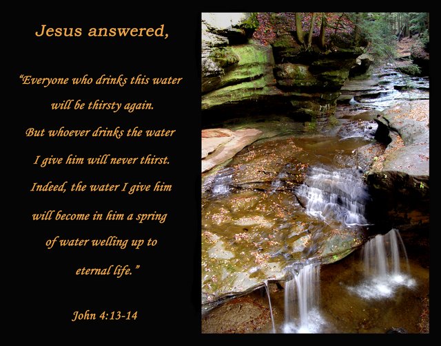
Hey, this is a really great card/inspirational postcard/poster. The picture on the right is gorgeous with excellent colours and well, excellent everything really.
The only suggestion I might have is that there is a bit of a hot spot in the top left hand corner on the rock that is a bit distracting from the water. Even some of the other rocks on the edges are a tad bright. You have done such a great job highlighting those water fall spots, it is a shame to have the distractions to the rocks. Burn?
Message edited by author 2005-09-27 23:37:01. |




 Add photograph to your favorites
 Add photographer to your favorites


 Photographer found comment helpful.