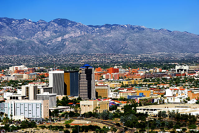
I have shot cityscapes that I would love to post for challenges but once I’ve reduced them they just look too busy but the full size image is quite stunning so it’s rather a challenge to comment on images only seeing a reduced version. I’m going to guess that the full size version of this image is spectacular, however, the reduced 640 does not do it justice.
The image appears flat and the buildings appear too small giving them a sort of toy city look - it appears as if the image has been over sharpened giving it that flat look and boosting the overall saturation. The houses at the base of the mountain range are barely discernable and almost appear to be noise.
The colors in the cityscape are fantastic and really give you a flavor of the Southwest. You maintained a lot of detail in the mountain range and in the city. I think a lower vantage point might have worked better for this image, the cityscape with the mountains as a back drop – perhaps simply showing the colorful buildings against the mountain range without the dead space in the center even though it would eliminate some of the architecture would have worked better – there is a parking garage at the lower right of the frame that may work well from the roof top (the sometimes less is more theory).
I hope this information is helpful in some small way. BTW your portfolio is fantastic love the jaquar entry for the affluance challenge.
I really like the colors and composition, but I think you tried to get too much into the picture. All of the buildings are too small and I feel like I have to squint to see them. I like the orange, blue, and white of the buildings against the purplish blue of the mountains.





 Add photograph to your favorites
 Add photographer to your favorites


 Photographer found comment helpful.


