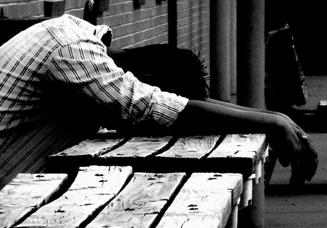
One of my top 3 favourites in this challenge. But I had a feeling the rest of DPC wouldn't agree with me :-)
I came close to giving this photo a 10, but I feel the contrast is a bit too strong, so I lowered it to a 9.
I like the contrast here and the idea. Compositionaly I think maybe it would have been better if his arms didn't run across the middle of the frame like that. Maybe some more table in the bottom of the frame to move the arms up a tad.
I'd like the title to not have the word destination in it. Just my personal preference. I like the sense of despair. Maybe a tad more focused would really give it some punch. The urban setting works well.





 Add photograph to your favorites
 Add photographer to your favorites


 Photographer found comment helpful.


