*Hello from the Critique Club*
(Congratulations on a well-placed first entry--and welcome to DPC!)
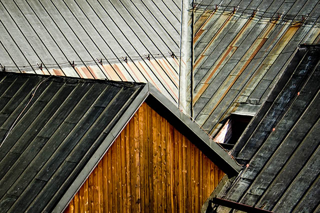
This image has a wonderful graphic quality to it! I love the way the lines play off one another! The color is inviting and warm. The texture is appealing.
The focal point of the composition, to me, is the triangular side of the building. It provides an interesting shape and leads the way in to the rest of the composition. Its color sets the standard for contrast and also pulls the rusty colors from the rooftops. There's a lot for the eye to enjoy as it wanders through the lines of this picture.
Technically, it seems to be a little soft. I'm not sure exactly what is in focus--perhaps lines on the near roofs--but the wall seems to be out of focus. To heighten the graphic quality all, or most, of these lines/elements should be in focus. Since your depth of field was (apparently) limited perhaps the issue is focus--it could be that a little more sharpening in post-process would satisfy more as well.
Some of the commenters suggested a different time of day--I think they may be looking for heighted contrast, greater shadowing to pull out the different layers of the roofs--I don't know that I agree but perhaps that would provide a little more "pop" to the elements presented here.
Overall, a well-received image. I like what you have done here. The photo has graphic interest. The composition leads the eye...even to that wonderful opening in the one roof which begs the viewer to consider it and its purpose.
Good balance of color and non-color. Fascinating use of lines. It leads me everywhere and no where. Keeps me looking! Everything captures my interest without distraction.
Very neat. I wonder if taking this at a different time of day would provide more depth which maybe might be good. Regardless I love the angles and directions.
Finally. Something I can give a decent vote to. Sheesh. Beautiful, great seeing and composition...nice tones. I wish the highlights were a little less harsh...perhaps taken later in the day would have been more appropriate? Good work, though. 8
Nice lines. You have a good eye. I'd like to see more detail, though...especially at the top of the picture. Perhaps adjusting the lighting and contrast a little in photoshop would bring out the subtle details more.
I love this. The warm browns with the cool greys along with the geometry of it all makes for a very artful shought. Nicely thought out and executed. One of the best I've seen so far.





 Add photograph to your favorites
 Add photographer to your favorites

 Photographer found comment helpful.


