I was going for contrast and I didn't have an orange paint that would mix with black right (different bonder causes some paints to clump) I could have used colored paper but what color would look right with this??
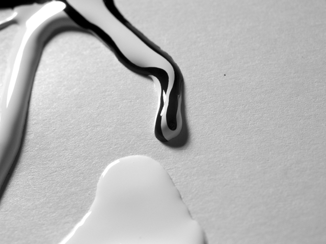
Why black and white? I like the swirly paint effect but think it would have been much more effective in colour (unless, I suppose, you are using black and white paints, in which case a coloured background would have been nice; this renders it a bit bland).
Very nice shot. I like the contrast in the black and white paint from that one stream in the middle. The balance could be better. There's too much empty space to the right IMHO., but thats hard to controll if the paint was flowing.
I like the idea....but composition I find a bit awkward....maybe flip 90 left or right or tighter crop around paint dribbles....could be a bit sharper - more dramatic b&w.
yes, this pic had make me paused from moving to next pic. very nice constrast, even in b&w mode. give me very clean and sharp feel. u have a sharp eyes and good observation. a big 8 for u ^ ^





 Add photograph to your favorites
 Add photographer to your favorites


 Photographer found comment helpful.


