Hello, and greetings from the Critique Club. The critique you are about to recieve is tailored for DPC challenges alone, and is not intended to be seen as an artistic critique per se.
Initial Thoughts
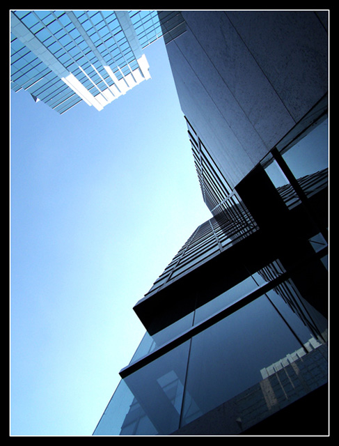
A really nice perspective shot, love the lines.
Composition / Content
The strong geometrical aspect of this photo intriques me. I love the 90 degree angling and the blocky look. It's futuristic in a way, yet contemporary as well. If there's just one issue I have, is that the tilt of the main vertical line in the photo (from the bottom corner of the main building to the top corner) is tilted, and I can't help but feel it might have been stronger if it was straighter.
Background
The sky fades in just a *little* to brightly for my tastes. Polarizer would have really helped here.. or an ND grad filter of some kind. Don't know if they're available for your camera though
Camera Work / Technical
A good exposure, marred only slightly by the sky. Great focus, great DOF.
Digital Processing
No information given, so I cannot comment on this area.
Fits the Challenge
It definitely fits the challenge, and in a pretty nice and strong way. You were probably hit by voters because of the sky and because of the lack of any really dynamic coloring (and possibly because of that tilt of the main vertical, but hey.. that could just be me).
My Opinion of the Photo
A really nice shot, with some fantastic perspective. A couple of tweaks and this could have really shined. I still think it could have placed a little higher, but a 5.8 is really nothing to be ashamed of at all. Good job, and good luck in future challenges.
It was ment to be simple though, I guess it's because I'm from a design background (Photography being a hobby) It wasn't supposed to be over powering, because when I look up at the sky in they city it seems like the only peaceful place down town.
I really like it. I wonder if a slight counter-clockwise rotation would give more 90 and 45 degree angles which might make it impossible to quit looking at. Good job.




 Add photograph to your favorites
 Add photographer to your favorites

 Photographer found comment helpful.


