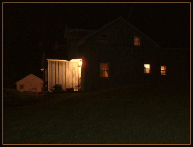
When I pull into my driveway after a long tiring work day in the big city, I look at my welcoming house, smell the clean night air, spend a few minutes looking at the stars, and know that I am home. In those few moments, I feel all the tension of the day just drain away.
Statistics
Place: 139 out of 175 Avg (all users): 4.4346 Avg (commenters): 5.2727 Avg (participants): 4.2200 Avg (non-participants): 4.6228 Views since voting: 1208 Votes: 214 Comments: 12 Favorites: 0
*Critique Club*
Well, there really isn't much to look at here, but living in the country myself, I can actually relate. It does say "Home" very nicely, especially to me on a personal level.
The visual appeal isn't really that high though. Cause there really isn't much to look at. I think that the most interesting part is the little porch to the left of the photo, but to the right of the barn. That wooden little inlet has the most detail of anything in this shot.
I do see though that if I jack up the brightness, I can see the outline of the house, and a hill in the yard. Even this is enough to add a bit of interest. I'm wondering if this is how you are seeing it on your moniter? With a slight more brightness?
When I set the moniter 'properly' this does appear to be a bit too dark. Definatley prefer it with the added brightness.
I think that the angle and framing/cropping are ok. The brightly lit garage/barn to the left kind of throws this off balance a bit. It's lit well, and detailed, and there isn't that kind of leverage on the right side of the photo.
For a low lighting shot, your focus appears to be very good. I see some detail in the wood slats to the left of the house.
Definately says home, and definately different, but lacking something to really make it stand out to me. Maybe it's jst as simple as a brightness adjustment.
~Heather~
Nice idea. I like the angle of the shot and how the lights make the house look very homey and cozy. Work on the graininess though. The image looks like it needs to be sharpened.
5. Fits the theme well enough, and there are no blatant 'you suck!' flaws to it, but neither does it really grab me for any reason at all. For reasons of composition, cropping, or subject choice, it's just a photo, and doesn't do especially much for me, aesthetically.
A disembodied, lit section of the inside of a cube seems to hang in space strangely, with nothing to look at inside it.





 Add photograph to your favorites
 Add photographer to your favorites

 Photographer found comment helpful.


