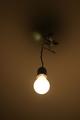
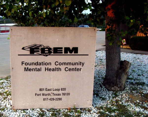
Composition - The choice of subject material for this challenge was a little questionable to say the least. I personally did not care for this composition due mostly to the choice of the sign. I also think that anything with a phone number should probably be left out. You must not have felt that way, but I can respect that too. I don't find this a terribly interesting subject. I can see the humorous approach you took to this challenge with this subject, but its not terribly effective to that approach either.
Technical - Its pretty flat on the whole. There really isn't anything done out of the ordinary with the lighting or the perspective. Its reasonably well focused and there are no real obvious flaws with the DOF or exposure. There doesn't seem to be any extraneous post processing which is always a plus to me.
Overall - I think the choice of subject was not a very sound one. It's cute for a very brief moment, but that's about it. I don't care for this photo and I think the only recommendation I can offer is to choose your subjects a little more wisely. Perhaps a blue wasp. Have you seen them? they are cool! Sorry I'm a little disappointed Anachronite. Good luck next time - Bob
Good perception of this challenge, sinister, yet your reality not a cosy, safe interpretation . Except i think a different angle would have made better composistion. 10 for interpretation






 Add photograph to your favorites
 Add photographer to your favorites

 Photographer found comment helpful.


