*Critique Club*
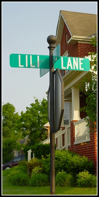
I can't decide weather or not I like the sign or think it distracts from the home. I think that it is a nice artistic touch, not just a plain old ordinary shot of a house, but it's right dead center of the house, so I'm thinking that maybe I wish it could be in a different spot.
The focus and clarity of both the house and the sign are good. you show us nice detail in the brick of this house and also make the text on the sign very readable and clear.
The lighting lookd alright. ALMOST a little bright on the sign, but not quite. The sky looks good. Not white and blown out as I see so often.
The car doesn't bother me at all. Gotta have a car with the house. Right?
The colors are really good. Stand out nicely, and are vivid and perfect.
Overall a nice shot. still undecided on the sign though.
~Heather~
Oh... I wish so much that you stood on the other side of the sign and shot the exact same picture...although I can see how the sign adds interest, that house and car on their own make a picture perfect suburban image. Great shot either way.
Maybe a little too much of a separation in the middle caused by the pole. Also creates a tangent with the front of that house which separates even more.
This is a wonderful shot. My only suggestion for improvement would be to move slightly to the right and take the picture, so the sign post is a little more to the left relative to the house - it would fill up some of that negative space in the sky that isn't adding to the shot. As it is, 7.
I get what you were going for here and I do like your composition. It's different. I guess I'm a bit boring, though and woiuld like to see more of that beautiful house instead of the street sign. Nice color and clarity. I wish the black car wasn't there. Nice job on cropping, it fits well.







 Add photograph to your favorites
 Add photographer to your favorites

 Photographer found comment helpful.


