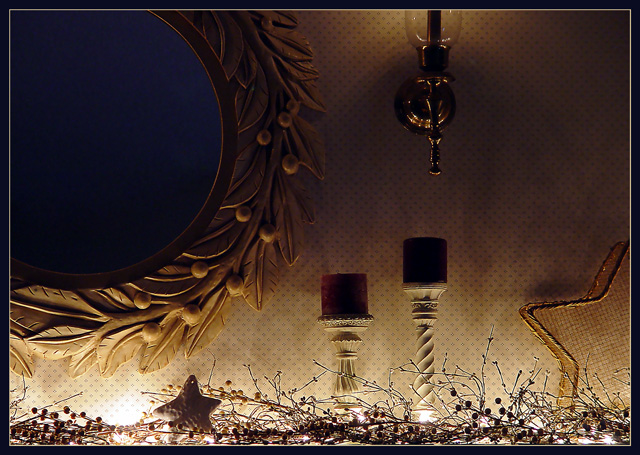
Hmmm. I like looking in home magazines so I actually find some interest in seeing interior shots like this. However, the picture doesn't really stand out.
It fits the challenge, and doesn't have any big technical problems. I understand that you're trying to show the small lights with the low lighting, but I don't really like it. I'm left looking in the dark for the subject and not really finding it. There are 3 major elements that have been cut off and lead the eye out of the frame. Somehow there isn't really a subject or particular point of interest. Maybe the candle holders and star could be isolated and be more interesting without all the distractions. I guess I'm just saying that the composition doesn't really work.
I gave it a 5 which is my middle-of-the road score. It's a decent pic, but doesn't really have any strong elements to make the viewer want to take a second look. The lighting is low but not dramatic. There aren't any strong lines or color. Good effort and decent score though.
interesting use of lights and shadows. should the mirror have some sort of reflection, say, a face, it would surely make this one spooky image! however, the blue on the mirror does look good too. great job 7
I'm trying to decide what, if anything, is alluded to with the latent meaning of the title. Would it be irony or sarcasm regarding the suburban baroque of the artifacts?






 Add photograph to your favorites
 Add photographer to your favorites

 Photographer found comment helpful.


