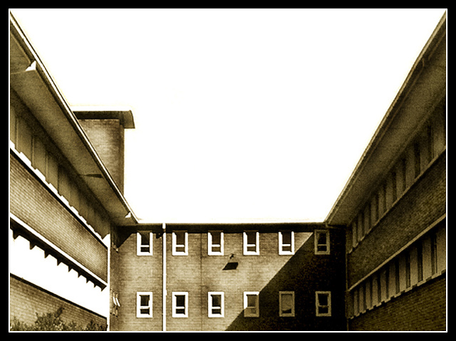
This is a nice idea for Perspective and Ilike the toning, it goes well with the old building.
There are a couple things that I don't like here. The blown sky is the biggest problem with this image. It is not very appealing and it takes the attention away from the subject. I know how hard it is to get a proper exposure when there is so much contrast between the foreground and the sky but a graduated neutral density filter or graduated gray filter usually works well.
Another thing is the white stripe on the left hand side. I'm not sure what this is but it's just very distracting. Not much that could have been done if it was that blown in camera. Keep trying, practice makes perfect :)
If you have any questions or comments about this critique, please feel free to PM me.
When I see a super-high contrast photo like this I always wonder if it's copout because the original had poor lighting or perhaps distracting elements...the end result works fairly well here, though.





 Add photograph to your favorites
 Add photographer to your favorites

 Photographer found comment helpful.


