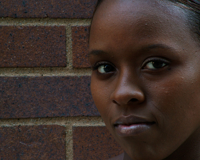
Colleague, friend and muse....well sort of. Took a portrait of Nakia for a Welcome to the New Site booklet at work and I worked on it a bit more after and it came out OK. She liked it and so did I. Fortunately, and or unfortunately as the case may be, without her I'd probably would not have been able to enter....this is not my area of expertise...in fact if the Portrait Thread starts up again, I may very well join.
We shot this at work today and used the bricks of the building as a backdrop....our choices were limited and the ones of Nakia agains the evergreen bushes just did not work out as well.
Natural light, no reflectors....would have but forgot to bring it. Camera was tripod mounted and I used the timer setting. Nakia and I decided on two shots of the same auto bracket of three and I went with this, the darker of the three. It is also the one we both liked we when first saw them on a PC at work.
Post: Tried several things and decided I just do not have a clue about processing portrait shots. I know there is processes that could be done to this but I went with as natural as possible. So any comments that could help this along would be greatly appreciated. No layer adjustments just a bit of Gausian Blur. I left Nakia's image alone except for cloning away a bit of her necklace above her right shoulder.
Did a slight distortion correction to straighten the bricks. Also cloned and/or heal brushed a few distrations of two brick faces and lost a few bright highlights in the mortor.
Statistics
Place: 103 out of 284 Avg (all users): 5.5894 Avg (commenters): 5.8800 Avg (participants): 5.5310 Avg (non-participants): 5.6433 Views since voting: 977 Views during voting: 434 Votes: 302 Comments: 29 Favorites: 0
Thank you so much for detailed information on your image. It helps greatly!
You got many comments on this image during the challenge and they all have different ideas for what they would like in the image. All are as valid as any I can give.
Reading through your comments, I note that you state you don't have much experience in portrait processing. Believe it or not I think you have the hardest part down - taking a great image. There are many ways to process a portrait and none of them are right or wrong - it all just depends on your taste. I prefer the look you used - the natural approach.
Two things to maybe work on with a close portrait like this where the background is irrelevent: the eyes and the background. With the eyes, typically you want them to be sharp - not overly so they look out of place, but just so viewer's eyes are drawn to them. Another thing to check with the eyes is the whites. People prefer them white. This also makes them stand out.
The background in this particular image works for me. However, it does distract from the face a little, so you may want to lighten, darken, blur or anything really. This again would put more emphasis on the face.
Honestly, you started with a great image. Technically well done. I did a quick edit to show what might result from some of the suggestions I and other commenters made but really, its all a matter of taste.
She is lovely and the lighting is nicely done. I think I might have used a little post editing to soften some of the imperfections in her skin and still left it with a natural feel. The bricks create a monochromatic theme with her dark skin tones, but I'm thinking either a black solid background or possibly a white one would really give this some more punch since the pattern is a bit distracting from her face.
Very naturally pretty model. I don't like the fact that part of her face is cut off (the left side & her chin). Also, there needs to be more light on her face. A lighter background might have worked better as well, to give more contrast between the model and the wall. I like her stare into the camera. Good luck :)
I wonder how this would look with a bit more contrast between her skin tones and the background? I don't know if it was intentional on your part, but I like how the line of the bricks draws my eye into her eyes.
Beautiful model and outstanding image. The details and textures are strong in both the hightlights and the shadows. This is a very strong image, as I feel this model is staring right at me. Great capture. I hope it does well for you. Good luck! <9>
Like the texture of the skin and you have a real sharp image. The color of the bricks didn't help your image of the pretty girl. They are so similar they compete for attention. I would have used a different background. My opinion.
I like the models face, good focus and expression especially the gloss on her lips but the brick wall is too close to her skin color and causes it to not have enough contrasting tones.
I think I would like to have seen this same picture up against a lighter background. I still think this is an excellent photograph and I love the look on the girls face! Good Luck in the Challenge!
I lovethe color of her skin and the fact that you didn't plasticize it with PhotoShop. I think a lighter background could have complemented her a little more, but the "roughness" of the background serves as a good contrast to the softness of her skin. Well done. Good luck in the challenge!
this is a good portrait..even though the brick seems to blend into her skin, it works here as background. I like the way you positioned her face, the lighting is very soft and flattering.
I wish there was a little more POP at first glance- but it's still alright without it. The subject has natural beauty hard to find in a lot of these portraits. Good job.







 Add photograph to your favorites
 Add photographer to your favorites


 Photographer found comment helpful.


