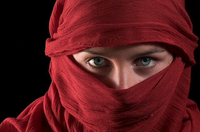
Howdy Aleks from the critique club. Firstly, an excellent submission. The final score clearly indicates that many voters found this image to be among the best and this why, I would say, it is so. On a technical side, I think you've nailed it. The sharpness is excellent as is the coloration and and use of shadow. When I look at the composition closely, I see that you've cropped off the very top of her head and her chin as well. Good choice as it draws the viewer's attention to the eyes. Had I had to edit the photo, I would have slightly increased the saturation in the blues of the eyes as to create an bit more of an exotic feel to the shot. That being said, all other elements are really well done and I'd say the reasons I can figure it doid not rank higher are:
1) Either you love it or you just like it. I'd be hard pressed to say that you can really not like this shot. It simply is a very good photo.
2) This genre of photo has been used fairly often and this shot had to compare with some stiff competition. Now, yours will be one of the shots subsequent entrants will need to out-shine in order to get a high score.
Hope that provides you with a bit more insight. Peace.
I like the black background, the red scarf, and the beautiful eyes, but am not entirely crazy about the lighting on the face. I think I would have preferred to see lighting from one side only, giving a more mysterious look to the shot.
Very reminiscent of the National Geographic photo. A decent job on the lighting and color choice to contrast the eyes. The light appears to be coming from left and right sides leaving a sort of darker area right down the middle of the face. But I am by no means knowledgeable in the art of studio lighting. You have done a great job here.
I would have loved to see more light on the eyes as they are the main subject here but they are a little darker and there is more light on the scarf....
A beautiful image. Love the red veil against the black background. The skin tones pick up the red from the veil as well, and the eyes are piercing. The texture in the veil is outstanding, as is the detail in the face itself. This image should do quite well. Good luck! <8>
Very nice lighting here. Seems like two sources of light one strobe and one natural on the left and right, am I right? Well whatever you used I am drawn to stare into her eyes, I am sure that was a goal of yours when taking this, thanks it is a pleasure to look at your work here.
Lighting and veil have wonderful color and contrast. By covering up all but the eyes aren't you trying to accenuate them, they seem to disappear and add nothing to photo.
Lovely crisp clean image with excellent lighting and very hypnotic eye contact. But I think the veil look has becomed a little overdone on this site, that being said I'm trying not let that effect my voting.
Stunning eyes. I would like to see more of her face, but then the whoe red gauze thing wouldn't work. Nice lighting and skin tones for sure!! Good use of negative space.
That red is very beautiful and pleasing to look at- I only wish the eyes popped out a little bit more and contrasted with the red, but it's still beautiful. Nice lighting!







 Add photograph to your favorites
 Add photographer to your favorites


