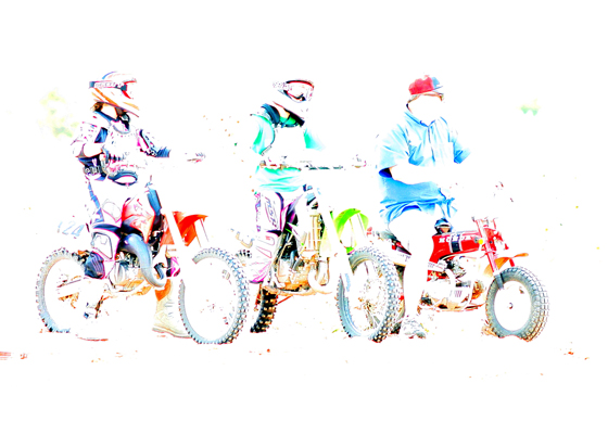
It is difficult for me to critique this photo when I have no idea what you were trying to portray. Perhaps a brief description on the Photographer's Comments would have been helpful.
I must give you kudos for thinking outside the box and daring to enter something like this but as you can see, it's not the sort of thing that does well on this site.
What bothers me the most about this image is that I can't see the faces. They are there, but completely overexposed. Perhaps you could have the subjects properly exposed while you turned the background white. The composition is good.Other than that, there's really not much I can say. Keep trying!
If you have any questions of comments about this critique please feel free to PM me.
This is fun editing, but has no sense of portrait at all. The colors are neat but I think you need a close up of a person for it to meet the challenge.
This hurts my eyes to look at. Almost all detail is lost in this photo besides the treads of the tires. Super overexposed entries or photos processed this way aren't usually successful.
This is pretty cool as a digital art type piece. Not quite sure it fits for a portrait challenge though. The colors are very cool and I like how you can't see any faces. I like it being overexposed and how the last guy doesn't really quite fit in with the others. But for this challenge it doesn't seem to work, for me anyways. It's still cool though. :-)
I feel that there isn't muh to look at here. The image is so high key, that I'm left with nothing to explore, and the lack of a specific portrait is also of concern for me.






 Add photograph to your favorites
 Add photographer to your favorites


