Hello, and greetings from the Critique Club. I am your critiquer, Artyste, and I hope to give you a critique that you can possibly build on for the future.
Initial Thoughts
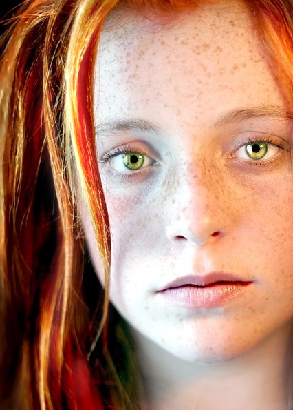
Stunning eyes, but overshadowed by the overexposure.
Composition / Content
A beautifully composed portrait that might have been stronger if you left slightly more room on the right side (and possibly cropped a touch more from the top). Your model is stunning and has a wonderfully candid and unnervingly intense expression.
Background
The fall off of her vibrant hair makes a wonderful background. I suspect that for some people, however, the DOF dropped a little too quickly It works for me.
Camera Work / Technical
The one major issue that I see here is the overexposure. It really exposes the shallower DOF more than it needs to be, and gives the impression of a lack of focus that isn't really there. It takes a slightly closer look to see that the focus really is great.. but because of the light look of the photo, first glance really tricks you into thinking it's a lot softer than it is. Of course, this is easily fixable in post, since it's not actually blown out in any area. (well, the chin area is a bit, but I'm not sure if that is from the camera or as a result of processing).
Digital Processing
You didn't give any processing info, so I can't really comment on what you've done.. but I do suggest that you try dropping the far left hand slider in Levels a bit to darken up the blacks, and if you have Selective Color, use the neutral channel and give the blacks a bit of a boost as well. That's just basic suggestions, but this shot would definitely benefit from a lower exposure.
Fits the Challenge
No worries here, it fits the challenge beautifully.
My Opinion of the Photo
As always, I tailor my critique to what works well on DPC itself, and not necessarily what works artistically. This is a very intensive portrait, and I like it a lot. The overexposure issue probably did result in a few lower scores, and I personally believe it would look better with a few tweaks.. but overall, you've got a stunning portrait and a beautiful model. Good work, and good luck in future challenges.
I like the expression and the amazingly captured eyes! The strands of hair add a lot of depth and of course great contrasting color here! IMHO, the lighting on the left side is a bit too harsh, I prefer the right side light... I would also try cropping out more at the top to really let the viewer focus on the eyes instead of the hairline! well done
the picture seems a bit overexposed because the left side of the face shows some blown out highlights. also, it looks like you used window (ambient) light and a lamp. this introduces complications between the color temperature of the lights. thus, you have a blue and orange side of the face due to the different lights. it's best to use a reflector on window portraits instead of a new light source because of this color temperature difference.
good shot but I think you failed it in the lighting, the post processing looks good on the incandessant lit side, but the natural light side is too blue and blown out. other than that a potential ribbon shot. 7
I love red hair and freckles, but the lighting diminishes the freckles instead of brings them out. Her eyes are excellent, but I still would have preferred a different lighting arrangement. 7
Nice restrained photograph of a lovely model. I like the fact that you have suggested a quiet personality for the subject with your subtle exposure & processing, but still managed to hint at the existence of an unruly side with the stray lock of hair. 8
Like this shot and the feeling it gives but it is a bit burned out with flash or light of some kind. I would have rated it higher than a 6 because it had so much potential.
This really draws me in. Her eyes are exquisite and with the fiery red hair and freckles, it's just wonderful. So very pretty and natural looking even with the big boost to the red hair.
Wow...nice portrait, however you overdid the eyes....But since I dont mind freaky editing, this doesnt really turn me off. However I think it may have been better with less eye editing.
Incredibly good looking! Love those eyes...
I like the use of shallow dof. Highlights perhaps a little blown, but deos not degrade the picture much. Well done!
I'd very much like to see this shot before it got over-worked in the post. Perhaps it's the light, but the face here seems to have been removed of much of it's natural beauty to be replaced by flat, unnatural tones clearly mocked up in computer software. A shame IMHO.. 3
Anything different is welcome to me in this challenge. Her eyes are farther apart than the norm and the color is quite unusual. Nice contrast to the red hair. I like the one piece hanging in her face. The skin tones seem a tad washed out, but it suits her pale eyes. Nice use of light.





 Add photograph to your favorites
 Add photographer to your favorites


 Photographer found comment helpful.


