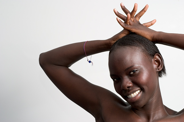
I like compostion here. The placement of the model in a corner works in this case and the negative space doesn't take away from the subject. The facial expression is nice and the pose looks very relaxed. The contrast between the background and the model's skin color is also nice, it definitely makes her pop out and be the center of attention, as it should be.
While the lighting on the model is good, bar hotspots on here face, I think the background needed another light source on the left. This would have given you a perfect white background and made this portrait much stronger. The bracelet is another thing that bothers me a little, it really doesn't add anything to the image and is distracting. The eyes could benefit from some dodging, they are the first thing that people see in a portrait but in this case my eye keeps getting drawn to the much brighter smile.
This is just my opnion and you did well on the challenge so keep up the good work.
If you have any questions or comments about this critique, please feel free to PM me.
Great photo! Depending on how much control you had over the lighting, the shadowing seems a little heavy on the right arm and side of the face. Good, clean focus and a nice expression on her face. I like the slight reflection of the light source on the face but I might consider making the background more consistent. Consider removing the bracelet. This is one of my favorites of the challenge.
Super portrait and wonderful, original pose. This photograph gives the viewer an insight into the appealing personality of the subject. I know you probably meant "Charm" as a reference to the jewellery, but there's plenty of the other kind of charm, too. 8
Lovely model. Pose is good, and lighting on the right side is very nice,but I find the shadowed side to be a bit too dark. A touch of light would have brought her eyes and her teeth out in a most pleasing way. Possibly if you had used a relector on that side to bounce some light in. Also, there appears to be a shadow on the left side , if this was caused by the models arm, you could try moving her a bit farther away from the background.
great pose and cropping, I wish there was a bit more detail on the shadow side of the face, a second light source or a reflector and this would have been right up there in ribbon land.
Great picture and I love the simple white against her dark skin! The only thing is the braclet, it just kinda messes up the simplicity of a great photo. Still very nice though!!!!
Nice angles and shapes in her fingers and elbows. I think I would have liked to see her more centered. I don't liek the left arm cut off where it is now.







 Add photograph to your favorites
 Add photographer to your favorites

 Photographer found comment helpful.


