Very poor lighting I had to work with. Not the best of shots at all but I wanted to submit something. =/ GL Austin!
Post-Challenge:
Wow, top 20! Never would have expected this. Thanks for everyones excellent comments! I think what hurt me the most is the border. =) Having a border at all can hurt but having one as thick as mine...well. Lessons learned!
Statistics
Place: 17 out of 284 Avg (all users): 6.6209 Avg (commenters): 7.5556 Avg (participants): 6.4490 Avg (non-participants): 6.7799 Views since voting: 1949 Views during voting: 487 Votes: 306 Comments: 42 Favorites: 5 (view)
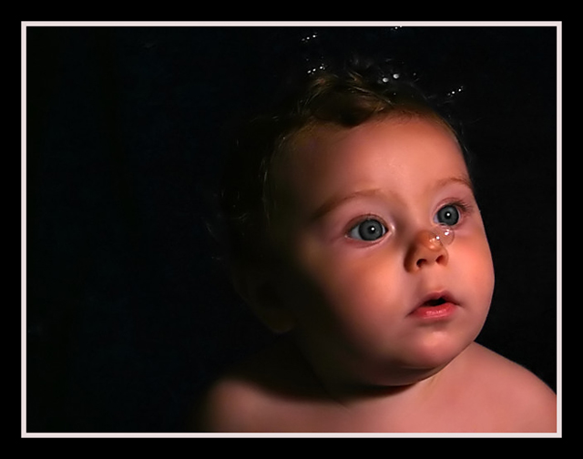
This is a very cute portrait, your model is very cute. The bubbles are a nice effect and I think the placing of the on his nose is perfect.
There are few things tha I don't like in this picture. The subject is looking away from the camera and that's fine, but because of the direction he's looking in, I would have placed him on the othe side of the frame and had the negative space in the directon he was looking at.
The hair and he background sort of blend together, there is no real definition between them, perhaps another light or a reflector would have fixed that problem. The loss of detail in the shadows is really shame because this is a nice portrait.
The bubbles around his hair are not very defined either and all we see is the bright spots and this a little distracting, I would have cloned them out. The whites in his eyes are bit dark and I think dodging them a little would greatly improve the overall look.
Another thing, I don't know if you used Neat Image or not cause you don't specify, but in my opnion the whatever noise reduction software you used was set too strong, he almost looks plastic.
This is just my opinion and you did very well in the challenge so keep it up.
If you have any questions or comments about this critique, please feel free to PM me.
I think I'd prefer having the subject "look into" the frame would work better; the bubbles can be "escaping out the top instead of the side. But I know there might not have been anything on that side for this particular shot, which does have great expression.
I appreciate the idea to use the bubbles, but the one on her nose serves to distract me. The portrait of the baby though is exceptional. Great Lighting.
Now thats just plain CUTE!,...OK, not so plain. Its a Wonderful shot. Love the tones, not too soft. They say the subject is supposed to be moving into the frame, but I really think this is an exception. Great job!
Great lightting and expression on the little one. Great skin. If I can be picky, and I can ;-) I think the right shoulder should have been burned into the background (or removed inany other way). 9
Awwwwww...what a sweet, sweet photo. The outer black border is a bit too thick for my taste, but I really like the bubble shadow on the nose. Good luck in the challenge. 7
Gasp!!! THAT is the most incredible portrait! I would be delighted to see this with a blue ribbon. Gosh. . .I hope you aren't taking hits tho about the border. Typically the dpc'ers are one border-hating bunch! The picture is nothing short of spectacular! Best of luck! 10+ I'm adding this to my favorites too.
I love this shot! I won't comment on the border, but I will say that just a little more lighting on the back of the head, and a little brighter all over would have really made this pop! I LOVE the Nemo reference! 8
What a cute shot. The eyes look a little soft to me, perhaps some selective sharpening applied to them would help. Wouldn't want to sharpen the whole image as the skin looks great. 7
EXCELENT!!!! amazing shot.. put it on my fav!!!
no point for the negetive space on the left though... maybe cropping!?!?!
and the kid have the flash/light in the eyes.. its easy to fix with healng tool..
9
EEK - kinda creepy - a baby underwater in a fish tank? The lighting is absolutely lovely. white balance maybe too pink? maybe if he was looking at the bubbles it woldnt look so much like he was gasping for air, those big eyes looking out? I think the heavy frame contributes to the fish tank feel, without the air bubbles if would be an intense portrait of a cute kid. On the other hand, if you meant it to look like an underwater scene, you did a great job! Either way ill give it a high score.
Now THIS is a portrait!!! The lighting and the closeness to the face is wonderful. The props of the bubbles just add more wonder to that adorable expression. The skin tones are perfect. What a gorgeous child. Those eyes! AUGHHHHHHH Your use of negative space and the framing - Spot on. TEN TEN TEN!!!






 Add photograph to your favorites
 Add photographer to your favorites

 Photographer found comment helpful.


