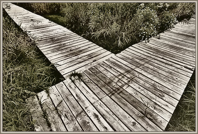
I didn't get to vote on 100% of this challenge so no "actual" score. I would have scored it on the high side for a few reasons:
- placement of the main element is great (central and yet not symetrical)
- it's an interesting tone and the muted colors give it a woody, hushed feel
- post processing shows care and an artistic touch
Only (very small) negative, the clump in the center detracts from the simple lines.
Theresa |






 Add photograph to your favorites
 Add photographer to your favorites


