This is a pretty subject, and the photo is pretty sharp.
My criticisms are similar to those that you have received already, an relate to lighting and post processing.
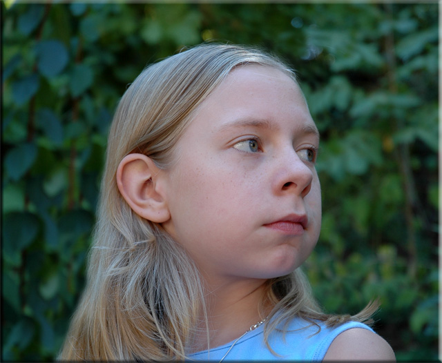
Your image is shot in the shade, which gives a very dispersed lighting effect. There are no significant shadows or areas of emphasis. This can be effective, as it is quite flattering whe your subject wants to avoid wrinkles, but your subject (hopefully) does not have that issue.
Some light shadows, or at least defined highlights, would have helped make this photo more interesting. Something from the side, or a combination of both sides (one stronger) might be interesting.
The post processing is important in improving slightly the colour saturation. Your image is slightly flat, and greater colour depth might have helped. DSLRs are set to be a little under saturate, especially compared to film (which tends to be designed to over saturate). COmbined with better lighting, this could be great.
Personally (and, in my experience, for this site), a fraction more sharpening might help the image (especially around the eyes).
Finally, composition is a little central (try having your subject looking into space (ie place the subject on the LHS looking towards the RHS). Alternatively, create a tension by placing her on one side looking out of frame. Having the eyes on a rule of thirds crossing point is the conventional method for achieving a strong image.
seems a tad underexposed. also try to achieve the most distance between the background on the model as possible to get a better background blur. the background leaves still seem to be a bit too defined.
Profiles are nice sometimes, but often don't turn out as natural as we would like. It seemed more posed than natural to me because I feel that her eyes are turned a bit too far showing too much white and her neck seems like it is also turned past a natural position. Some catch lights in her eyes would bring more life to the photo.
Her face appears to have a bluish cast to it, and I wonder how this would look if cropped in more from the left so your main subject wasn't in the center? I like the expression you captured...so serious.
I think I would have like to have seen this lightened a bit more and have her smiling too. She has such a pretty face and hair that I think with better lighting this would have made an excellent photograph. Best Wishes!
I find this a little compositionally bland, would have maybe placed her less centrally. You've exposed this perfectly, I'd really like to have seen you bring out the existing colours and tones in this shot in post-processing! A solid portrait - 7
try not to shoot looking up at people for portraits. It is always getter to look down slightly at them. By looking up you are making her cheeks look larger and seeing the underside of the nose and that is kinda a no no.







 Add photograph to your favorites
 Add photographer to your favorites


 Photographer found comment helpful.


