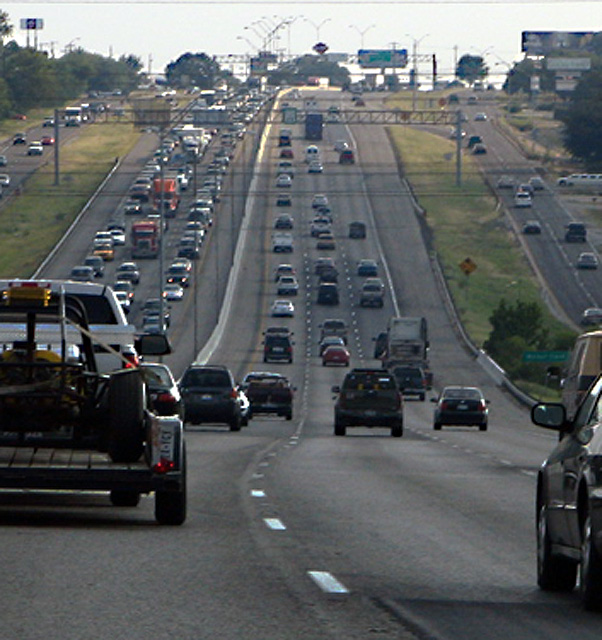
You have chosen an interesting perspective--both the point-of-view of the driver and the scene itself. The lines of the road play to the traditional "art" concept of converging lines of perspective. They show the depth of the scene well. The near symmetry of the roads offers balance to the composition. Much for the eye to travel around and visit.
The story in this photo, as I read it, is of being on the better side of the road at rush hour. I think if the truck on the left were absent the viewer would have a clearer view of the backed-up oncoming traffic...it would also lend more open space to give a stronger feel of the freedom of being on your side of the road. The near vehicle on the right contributes to the sense of being locked in as well.
The light falls on the far point of the hill. I think that helps take the eye into the distance. But once there, the sky is rather disappointing--not a huge detraction, though.
What probably hurt this most in the challenge has already been mentioned by several of your commenters--the image quality is not very strong. Grain (or noise) is fine for some subjects, but it gives this image the feel of something printed in a newspaper. I think the tonal range is also limited--again, not always a bad thing, but could the post processing have made some of those reds in the oncoming trucks "pop"? Are there undiscovered grey-tones whose detail has been lost that could make the photo richer, or more 'real'?
Normally, I'd say, "Go do it again, and try to improve your result based on the comments you find helpful..." However, I think I'd rather say, "Please drive carefully--both hands on the wheel and both eyes on the road." =)
I really like this perspective and I like how you have the cars lined up and you show all the traffic. The only problem is that the background seems to be a bit pixely or blurry.





 Add photograph to your favorites
 Add photographer to your favorites

 Photographer found comment helpful.


