Greetings from the Critique Club, Sherri ...
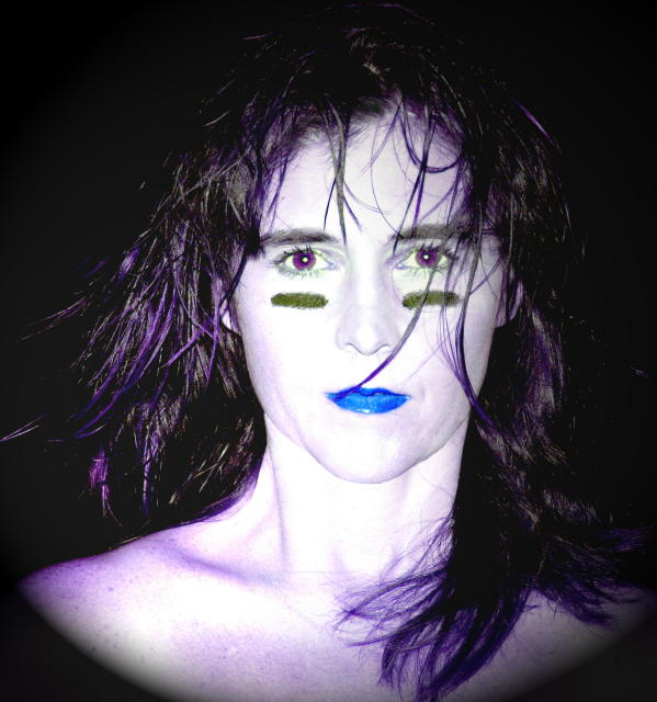
I am very pleased to have drawn your colour portrait for comment. As you see below, I appreciated your image during voting, especially as it came (for me) after a long run of nauseating pictures of people apparently made of molten plastic! Alas, the average voter treated you a little more harshly ... but such is the burden of the truly audacious. My critique of the image is very short & sweet: it was deliberately rebellious (against the concept of the 'ideal' portrait), and therefore thoroughly anarchic, and therefore aptly named. To be successful, such an image has to repel the majority of its viewers ... it's got to undermine their values and their comfort zone sufficiently to goad them into rejecting it. It scored only 4 point something (placing it behind at least a hundred entirely vacuous mediocrities). And therefore I judge it to have been a tremendous success. I'm sure that you do as well.
Cheers,
Paul Martin
The face is a little too cutesy for me to feel the title of the photo. It's kind of like cognitive dissonance. Attitude doesn't match behavior. I see more of a whimsical side to this photo. It's good, don't get me wrong, but the title doesn't go with the photo. In my opinion, of course.
Composition and lighting are good, it's aggressive and extreme. Can't say it's one of my favorites but at the same time I can appreciate the creativity and boldness.
This is just a tad weird for me. The green lines under the eyes and the blue lips just offend my eyes. I like the pose and lighting though. I guess people are loving or hating this huh? lol.






 Add photograph to your favorites
 Add photographer to your favorites


 Photographer found comment helpful.


